
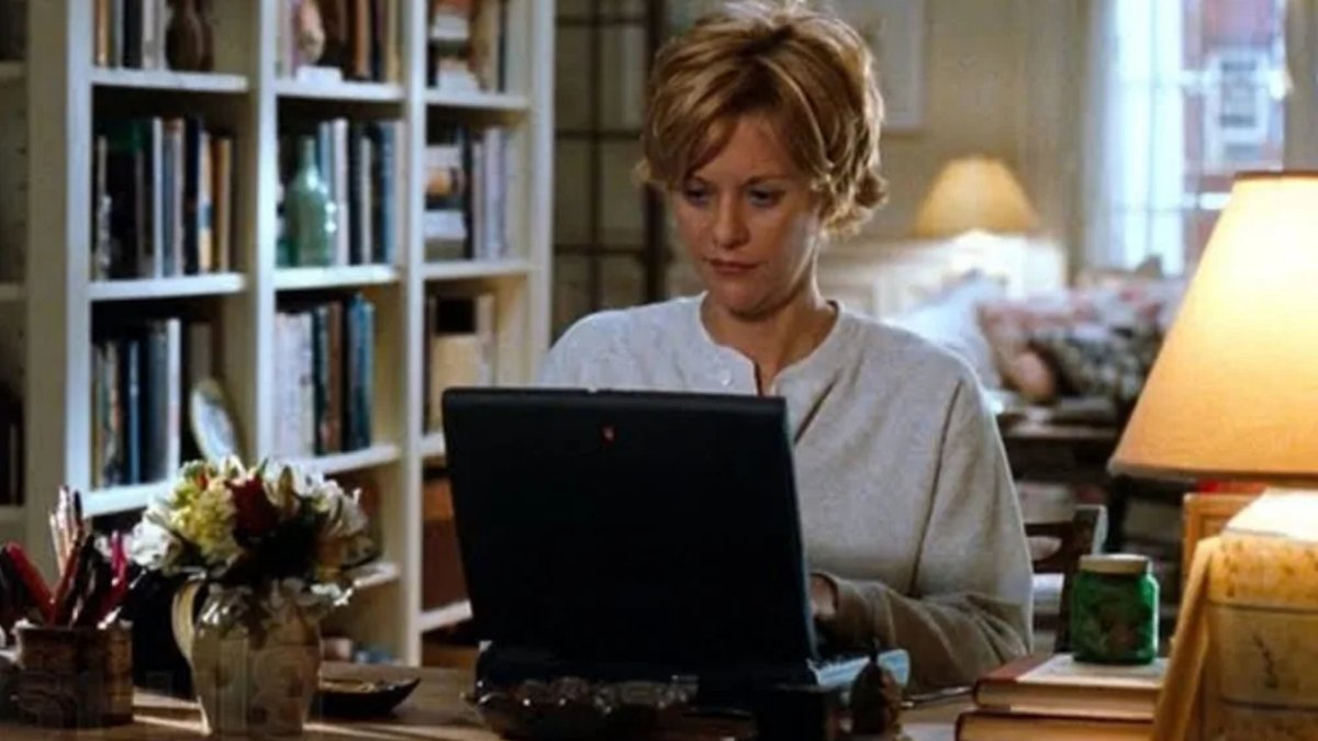
It has been almost 28 years since Meg Ryan and Tom Hanks reunited for the romantic comedy You’ve Got Mail, a film directed by Nora Ephron. While the world depicted in the movie has changed significantly, the warm, lived-in design of the sets remains timeless.
Opposites Attract in Interior Design
From the start, the film establishes a clear visual contrast between the two main characters. Joe Fox, a businessman running a chain store, inhabits a sleek, modern space with clean lines and metallic accents. The goal was to make her home feel like a shabby-chic sanctuary.
Nora Ephron was known for her attention to detail, a trait that extended to the film’s production design. Associate producer Dianne Dreyer described Ephron’s approach to the project as caring deeply about specifics. This meticulousness ensured that every element of the set supported the story being told on screen.
Behind the Scenes Secrets
Nora Ephron enforced strict rules to create a believable world. The apartments had to visually contrast with each other.
Read Also: Sydney sloped backyard reborn as poolside garden
The set contained thousands of real books. Her shop held 7,000 volumes while Fox Books held 25,000. Nora Ephron requested that these be stocked in proper sections. This attention to detail helped create a sense of history and community.
Building a Real Neighborhood
One of the more subtle techniques Ephron used to ground the story was the use of background extras. Nora Ephron pointed out during the film’s DVD commentary that a florist playing an extra was pregnant at the beginning of the movie. Later, when Meg Ryan’s character visits the florist, a small sign in the window reads, “It’s a girl.” This level of continuity gave the setting a genuine sense of life and community.
The set design relied heavily on the presence of books to create an atmosphere of knowledge and history. Fox Books alone contained 25,000 real volumes, carefully stocked in their proper sections to ensure authenticity.
A Strict Color Palette
While the film is filled with soft tones, there was a hard rule regarding one specific hue. Production designer Dan Davis revealed that Ephron banned the color blue from the set. She felt that blue often looked “ugly and jarring” on camera. The restriction applied strictly to the decor, meaning that even if the walls or furniture suggested a blue shade, it was never allowed to be the dominant color.
Read Also: NRL star Nathan Cleary buys beachfront cottage
Even with the ban on blue, the overall aesthetic achieved a high degree of cohesion. The use of warm lighting and consistent patterns helped tie the various rooms together, despite the limitations on color choices.
Real-World Inspiration
The independent bookstore in the film was modeled after Books of Wonder, a children’s bookstore on New York’s West 18th Street. Nora Ephron and her co-writer sister Delia frequented the shop, and they even arranged for Meg Ryan to work there for a week to research her role. This immersive experience allowed Ryan to learn the register and move naturally among the shelves.
Nora Ephron wanted the independent shop to feel like a place where anyone would be lucky to have in their neighborhood. To achieve this, she insisted on including first editions of classic children’s books as props. This choice signaled to the audience that the store was a serious establishment with a genuine connection to literary history.


