
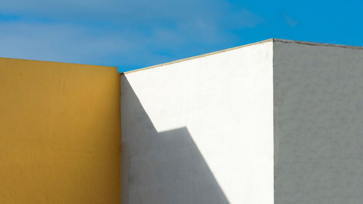
For decades, white walls dominated modern interiors. They reflected light, made spaces feel larger, and provided a blank canvas for furniture and art. But as homes evolve into places of comfort and restoration, the all-white aesthetic is fading.
Designers now prefer warmer, more layered palettes that add depth and emotional connection. These colors adapt to changing light throughout the day, creating dynamic atmospheres instead of static backdrops. The shift isn’t about rejecting simplicity but about choosing hues that improve well-being and reflect personal taste.
Mushroom tones soften hard edges
One of the most popular alternatives is mushroom—a blend of beige, taupe, and gray that avoids the starkness of pure white while remaining neutral. Unlike bright white, which can feel clinical, these tones soften architectural lines and create a cocooning effect. They work well with timber floors, linen upholstery, and natural stone, offering a timeless yet flexible backdrop.
This change isn’t just visual. Mushroom tones suit nearly any decorating style, from minimalist to rustic, without overpowering a room. The subtle warmth makes them especially effective in open-plan homes, where they unify spaces without feeling sterile.
Greige evolves into warmer territory
Greige—a mix of gray and beige—has existed for years, but current versions are noticeably warmer than earlier ones. Modern greige avoids the cool undertones of traditional gray, offering a soft, versatile neutral that lets furniture and artwork stand out.
Related: Designers Share Coffee Table Styling Secrets
Its flexibility explains why many designers now choose it over white. It pairs well with brushed brass finishes, oak cabinetry, and textured fabrics, making it practical for both contemporary and traditional interiors. In open layouts, greige provides visual continuity without the harshness of stark white.
The move toward warmer neutrals reflects a broader change in how people view their homes. A greige wall might not make a room feel bigger, but it can make it feel more welcoming.
Nature-inspired hues bring the outdoors in
Olive green has become one of the most adaptable alternatives to white, offering a muted connection to nature without overwhelming a space. It works in living rooms, kitchens, and bedrooms, complementing walnut furniture, woven textures, and natural fiber rugs.
Unlike white, which reflects light uniformly, olive green absorbs it gently, creating a dynamic interplay of shadows and highlights. This quality makes it ideal for spaces where mood matters more than brightness. The earthy undertones also fit the growing preference for organic materials in interior design.
Other nature-inspired shades, like warm clay and terracotta, are also rising in popularity. These hues evoke warmth and craftsmanship, often paired with travertine, limestone, and handmade ceramics. They don’t just decorate a space—they give it character.
Related: From Classic to Modern: A Review of Lab Grown Engagement Ring Styles Available in London
Cool tones find a softer approach
For those who prefer cooler palettes but want to avoid the sterility of white, muted blue-grays offer a refined alternative. These shades shift subtly with daylight, appearing blue, gray, or even green depending on the time. They’re especially effective in bedrooms, bathrooms, and home offices, where calm is essential.
Buttery cream is another white-adjacent option gaining attention. Unlike older versions, today’s creams feel soft and elegant, providing warmth without the clinical look of pure white. Designers favor it for its ability to suit both traditional and contemporary architecture.
Even deep charcoal is being reconsidered as a neutral. While it might seem bold, charcoal walls can create intimacy rather than darkness, especially when balanced with warm woods and layered lighting. The effect is striking but not overwhelming, making it a strong choice for dining rooms and studies.
The decline of white walls isn’t about abandoning minimalism. It’s about redefining what a modern interior should accomplish. Instead of focusing on making a room look bigger or brighter, designers now emphasize how a space should feel.
Today’s most successful homes prioritize warmth and depth. Whether through mushroom tones, olive green, or warm greige, these colors don’t just fill a wall—they shape the atmosphere of a room. The result is more than a backdrop; it’s a living part of the home.


